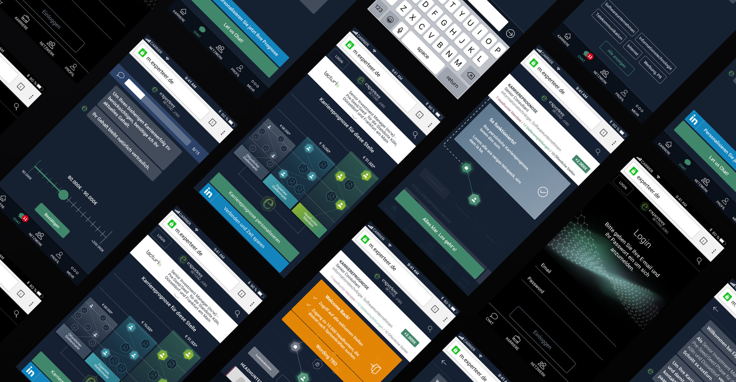
BEYOND JOBS
MOBILE APP FROM CONCEPTION TO LAUNCH
The new Experteer mobile experience steps away from a mere job board. Instead of asking you to operate a search engine, we do it for you by knowing your wishes and needs. It's different from competitors by providing tailored content that is valuable for your next career step.
As the only designer in the team, I was responsible for the user experience design from “0” to “1”. defined key features with product manager and stakeholder, launched the product with the product team and continue iterate according to feedbacks.
I conducted brainstorm sessions, created user flow, wireframe, communicated with stakeholder and team members, conducted several design review meetings, worked on visual design, created brand language and maintained design style guide.
I also contribute to supervise and test the implementation to make sure the final product can meet the requirements and deadline, continue iterating.
Credit: Experteer product team
In house work at Experteer, Feb - Nov 2018

Challenge
The design of an intuitive and appealing online tool, which organises client documents within one place, and allows to extract information and gain insights to ultimately improve accessibility and efficiency.
As the tool will require a need to be scalable, we aim for a modular approach, in which components will be designed and developed to be part of a system which can be used to extend the platform efficiently.
Research & Ideas
First it took me sometime to understood the business model of Experteer and the vision of new mobile experience. Experteer has a unique market position as the premium career and recruitment service. The question began with how to highlight our strengths and different us from competitors. Having understood the business model, I focused on researching recruitment trends and recent innovations. To do so, I carefully examine the apps of the most popular vendors in the sphere – Linkedin, Monster, Glassdoor, Indeed, and others. This research gave me a couple of useful insights and valuable ideas.
Information architecture
After research and rounds of discussion with skateholder, product managers, CRM team and developeps, we defined key features of our product and start the UX stage with creating the basic information architecture.

Flow diagram
Next step was created flow diagram, which helps us to figure out how people interact with our product. Flow diagram define possible routes in the user journey through the product.
Wireframing, validation and iteration
After flow diagram have been proved, I created wireframes (starting from drawing the first sketches on paper ended up with high-fidelity mockups).
Career path prediction is an unique and important feature of the product. The graph is to visualize the user different options how to advance in his career.
• For basic users, the goal is to convert them into paying members
• per default the first node in the first graph is selected
• there are two places where the graph can be shown: Job detail page and Dashboard
• Basic users don‘t see the full graph, the upper part of the graph is hidden and links to the upsell page
• Premium users can interact with the whole graph
Chat to us! We asks users a few initial questions that take about 90 seconds to answer. With selection boxes, auto completor, it’s very easy to answer the question. Once complete, we will use AI to match you with the most suitable positions.


