Streamlining Share Plan Administration
Redesign Siemens Global Plan Management
Overview
Siemens Global Plan Management is an internal platform administrative members use to store, edit, and access information about sharing plans for its 350,000 employees worldwide.
Siemens partnered with Fluid Design to rebuild the outdated platform. I led the project from proposal to final delivery, conducting design workshops, leading milestone presentations, and successfully managing client relationships.
The final delivery exceeded client expectations, leading to an extended scope.
My role
User Flow, Interaction Concept, Wireframes, Interactive Prototype, Visual Design, Design system, Frontend Quality Assurance, Design Sprint, Design workshop, Milestone presentation
The Team
UX Designer - Ella Xiao, Director - Christian Moser, Front-end developer - Peter Aiello, stakeholders from Siemens
Goal
The goal is to redesign the platform to address current usability challenges, create an intuitive user experience with clear information architecture, smooth workflow, and appealing visuals, also establish consistent design patterns for future scalability.
Challenge
1. Complexity and Learning Curve: GPM is a complex platform used by Siemens administrative teams worldwide, spanning diverse cultures and backgrounds. Due to its complexity, GPM requires substantial training to use.
2. Usability Issues: The current interface suffers from cluttered data, disorganized navigation, difficulty locating and editing information, inconsistent design patterns, and outdated visuals.
3. Maintain Current Framework: We need to determine which elements can be modified and which must remain unchanged, then develop a new design that improves usability and visual consistency while preserving the platform’s existing structural framework.
Approach
We collaborate closely with the client's internal teams to understand their challenges and develop effective solutions.
Throughout the process, we conduct regular meetings, design reviews, and presentations to ensure the design aligns with the client's expectations and user needs.
Kick-off
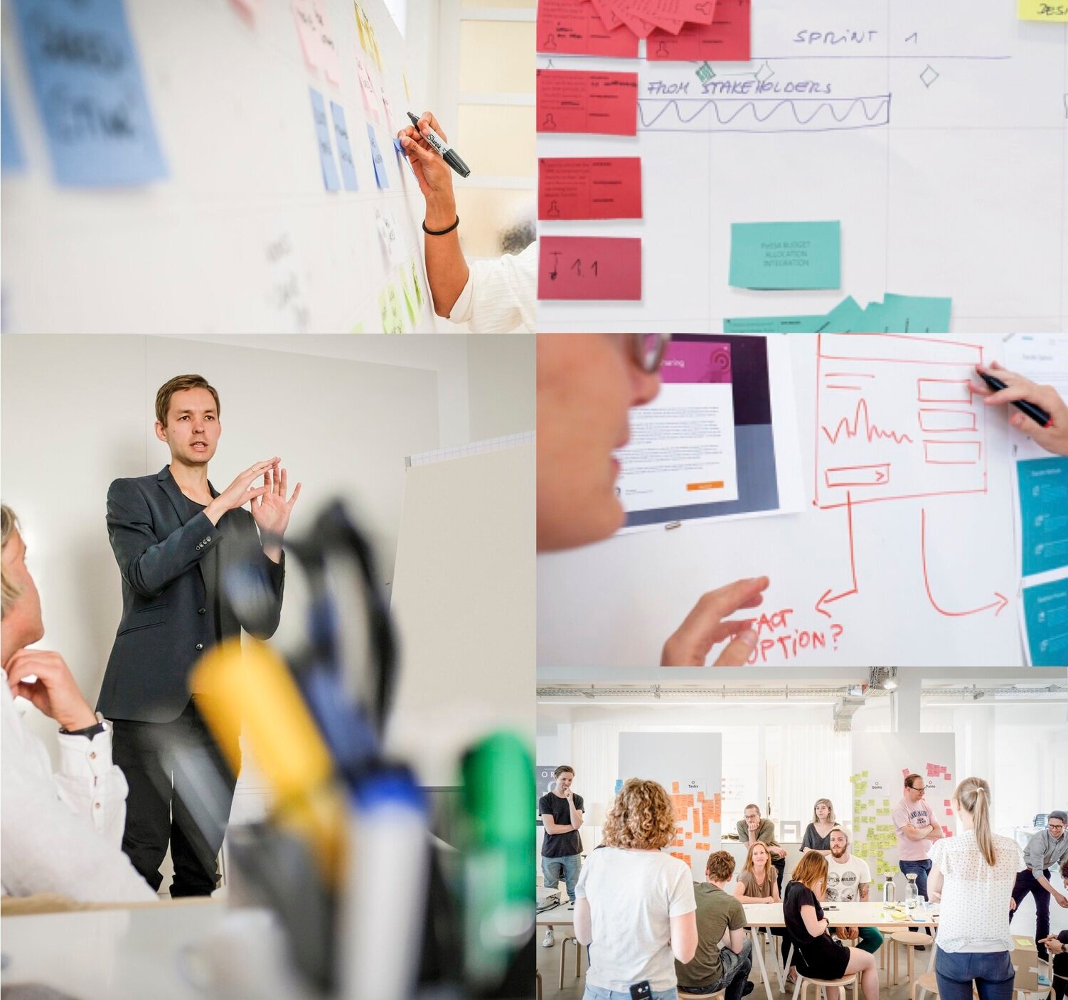
The project starts with a full-day kick-off workshop at Siemens headquarters in Munich. We reviewed briefing materials, user stories, and current challenges at the workshop and aligned with the project scope and timeline.
I prepared the workshop agenda and materials, conducted the kick-off workshop, and summarized the outcomes.
Simplifying Navigation
We began by reorganizing the cluttered navigation structure. Over time, the unstructured addition of features had overwhelmed the main navigation. We consolidated the original eight sections into six, creating a more streamlined and intuitive navigation.
Workflow examples of current GPM platform
Holistic Interaction Concept
We chose three essential flows - dashboard, employee overview, and employee edit - for which I developed wireframe concepts. Each concept offers a unique approach to these areas. I refined these concepts through multiple rounds of design reviews and iterations with the Fluid team.
I presented three refined concepts to the clients.
Concept 01 - My GPM
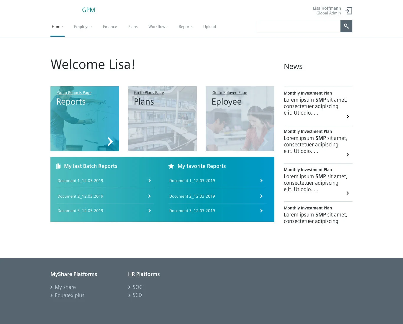
Incorporating the three most frequently used sections and allowing immediate actions.
Concept 02 - Customise Info
Highly customizable dashboard
Concept 03 - Powerful Search
Emphasizes a minimalist and powerful search-focused dashboard.
Concept Overview - Key Screens
Concept 01 - My GPM
Incorporating the three most frequently used sections and allowing immediate actions.
Concept 02 - Customise Info
Highly customizable dashboard
Concept 03 - Powerful Search
Emphasizes a minimalist and powerful search-focused dashboard.
Concept Refinement and Selection
We evaluated each for usability, aesthetics, and functionality through an iterative concept refinement process. After thorough reviews and feedback sessions, we selected Concept 01—My GPM as the optimal solution, balancing user needs with platform capabilities.
Developing the Visual Direction for Key Screens
We established the visual direction for the key screens by focusing on creating a cohesive and modern design language. This involved selecting color palettes, typography, iconography, and layout styles aligned with Siemens’ visual style and the platform's goals.
The visual direction should improve user engagement and provide a visually appealing experience. It should serve as the foundation for the final design and set the tone for a clean, intuitive, and accessible user interface.
Version 01
Version 02
Version 03
Version 04
Version 05
Version 06
Sprints
We executed five design and devolvement sprints to complete all sections and details. Below are examples of the screens developed during these sprints:
Scalable Design System
Extraction of essential components
Result
The successful delivery of the project received positive feedback from Siemens employees and had a significant impact on the Siemens team.
Success Metrics
Improved User Experience
The redesigned interface is now more usable and visually appealing, leading to better user engagement and satisfaction.
Design System Development
Progress toward creating a scalable and cohesive design system to ensure long-term consistency and efficiency.
Client Satisfaction
Positive feedback and approval of the redesigned GPM platform, leading to project extension and ongoing collaboration.
Extended Project Timeline
The project is extended by three additional sprints to complete all sections, indicating strong client confidence in the design.
Continued Partnership
Continued engagement to finalize all design modules and initiate a new project for the comprehensive design system.
Take Aways
Value of User-Centric Design: Prioritizing user experience and visual appeal significantly improved client satisfaction and project success.
Ongoing Collaboration: Building a solid foundation with the client paved the way for continued work, including developing a comprehensive design system.
Importance of Scalability: Focusing on a scalable design system ensures long-term consistency and adaptability, enhancing overall platform effectiveness.
Feedback-Driven Iteration: Iterative design reviews and client feedback were crucial in refining and perfecting the final product.


